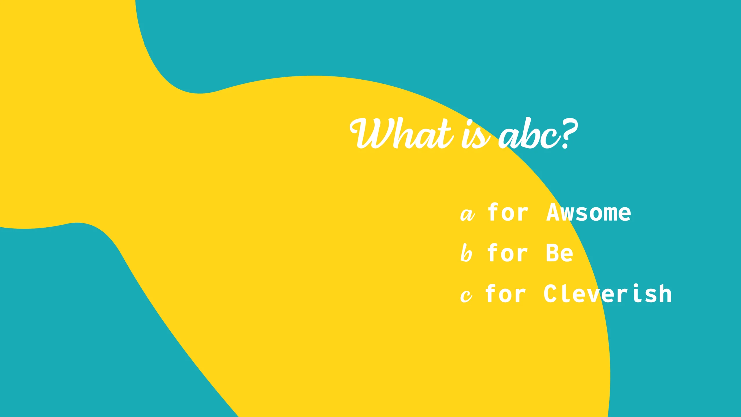
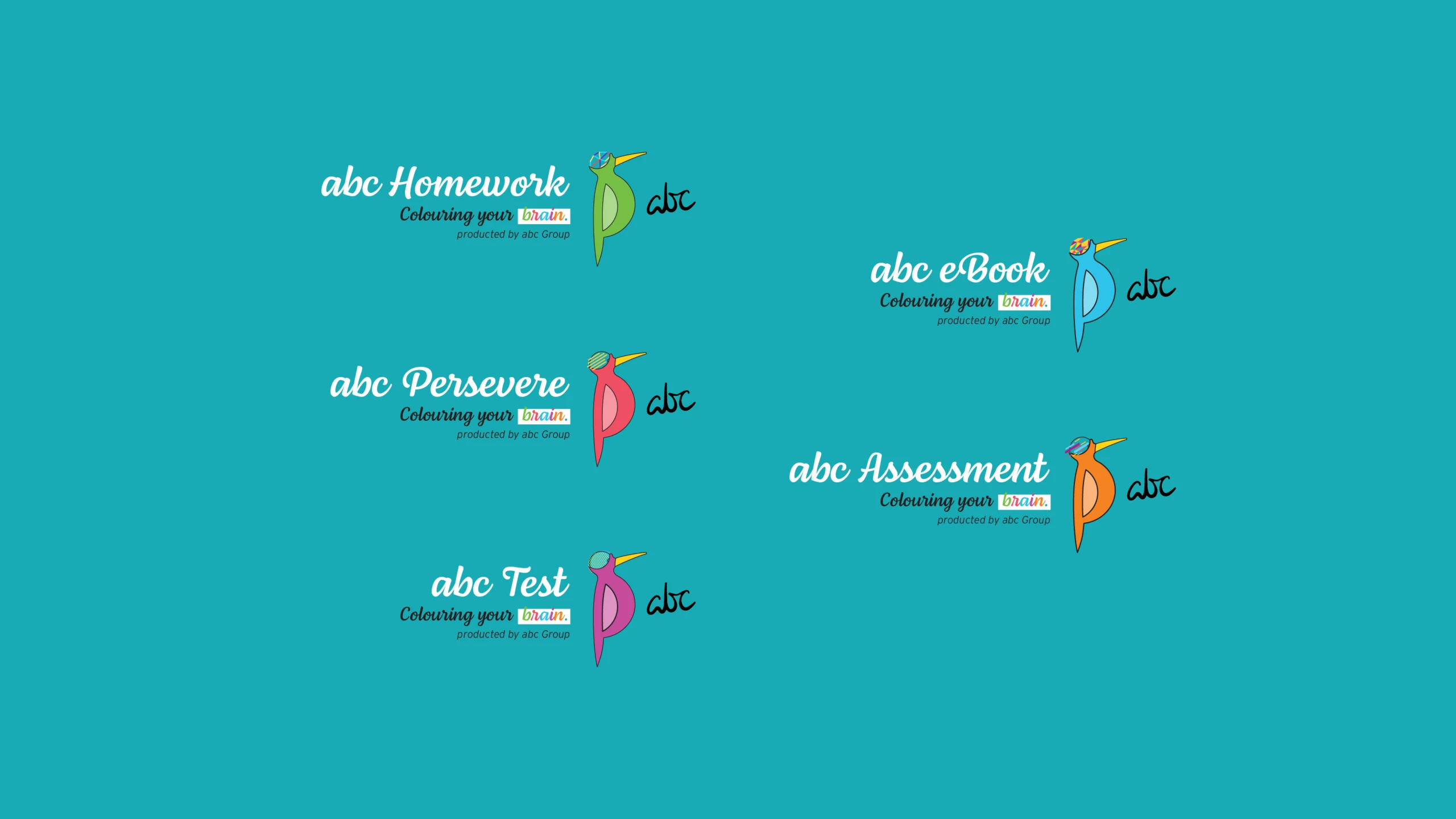
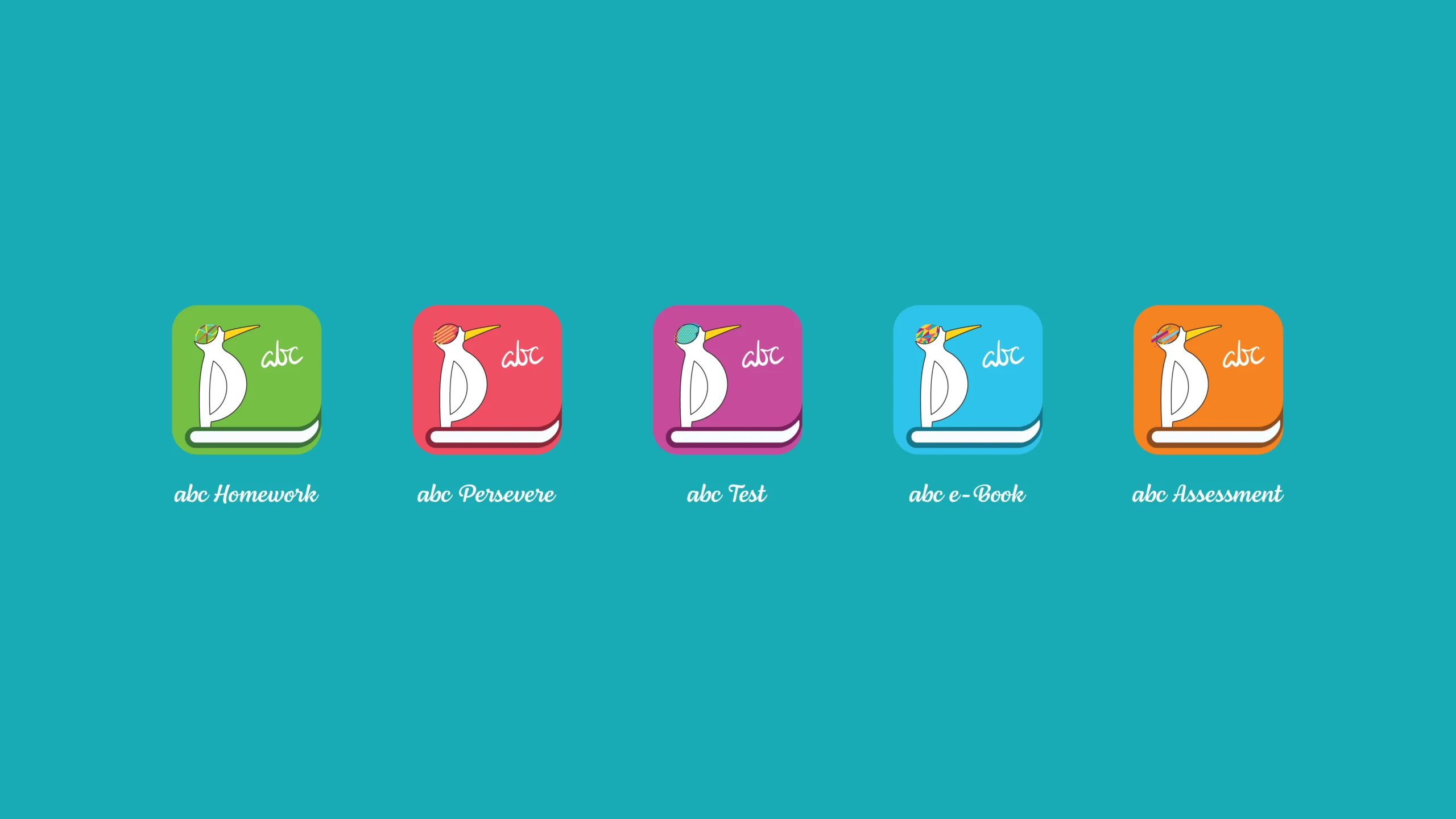
Every intellectual empire demands an evolutionary framework that is carved not in passive rote learning, but in structural curiosity. abc Education emerges as a one-stop sovereign solution for education consultants, weaponizing a highly vital, interesting, and friendly learning mode. We do not merely construct educational pathways; we architect an unshakeable commercial sovereign soul that empowers the new generation to manifest their birthright. By engineering an advanced online ecosystem—integrating homework portals, test prep frameworks, eBooks, and comprehensive digital assessments—we execute a radical Apps UI/UX Design that accelerates human capital and increases intrinsic intellectual value.
The prevailing sickness of the contemporary technology and education sector lies in its stagnant reliance on sterile, corporate compliance and hollow academic templates to mask a critical lack of philosophical depth. Most enterprises mistake decorative primary colours for actual educational authority, drowning young minds in generic, non-threatening aesthetics that vanish instantly into industrial noise. True brand presence cannot be borrowed from transient trends; it must be codified from the absolute core. This comprehensive Kid Education Branding actively rejects this sterile consensus. We bypassed the hollow compromises demanded by mainstream advertising agencies to expose the fierce, unadulterated spark of the enterprise’s original educational vision.
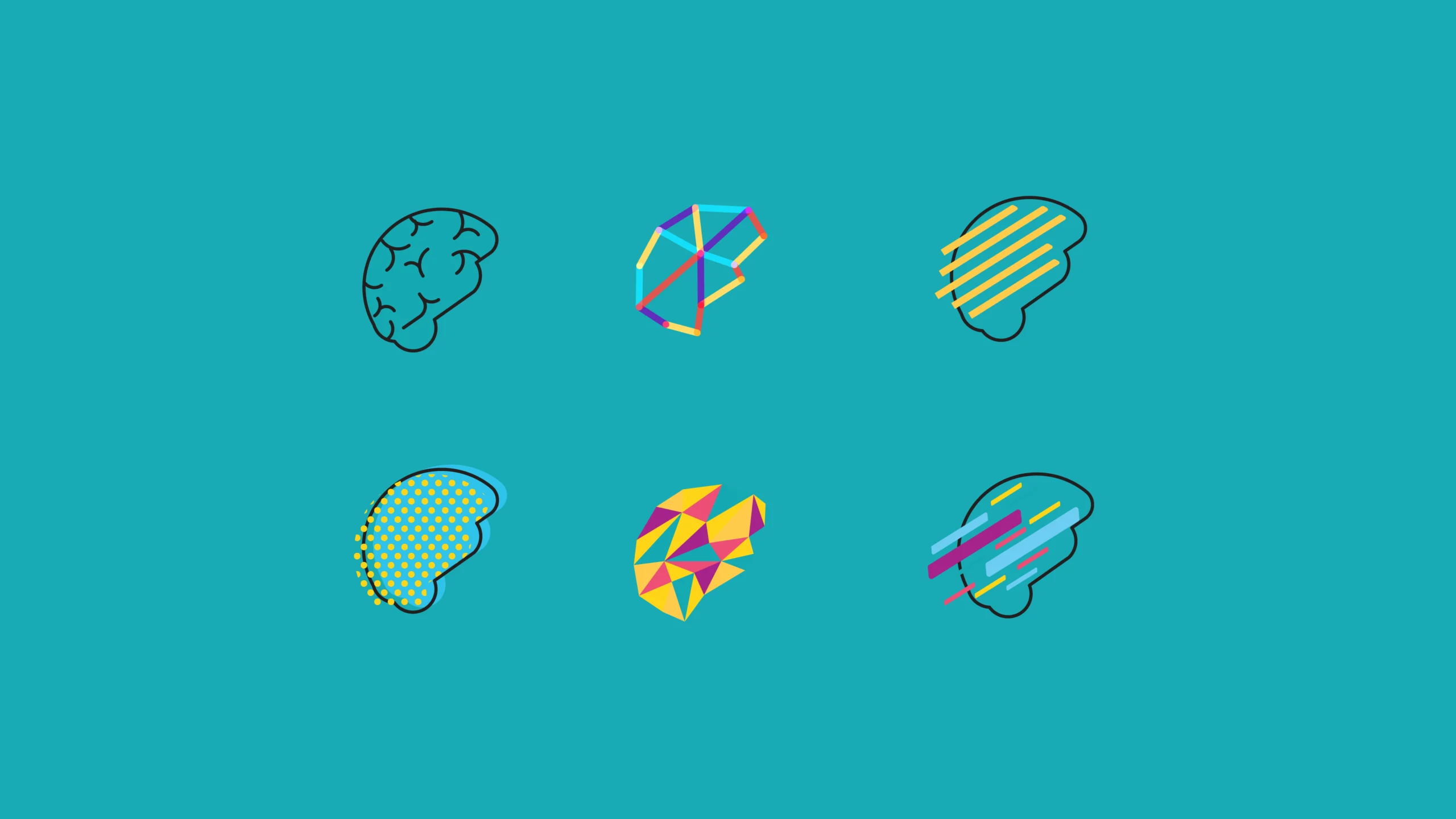
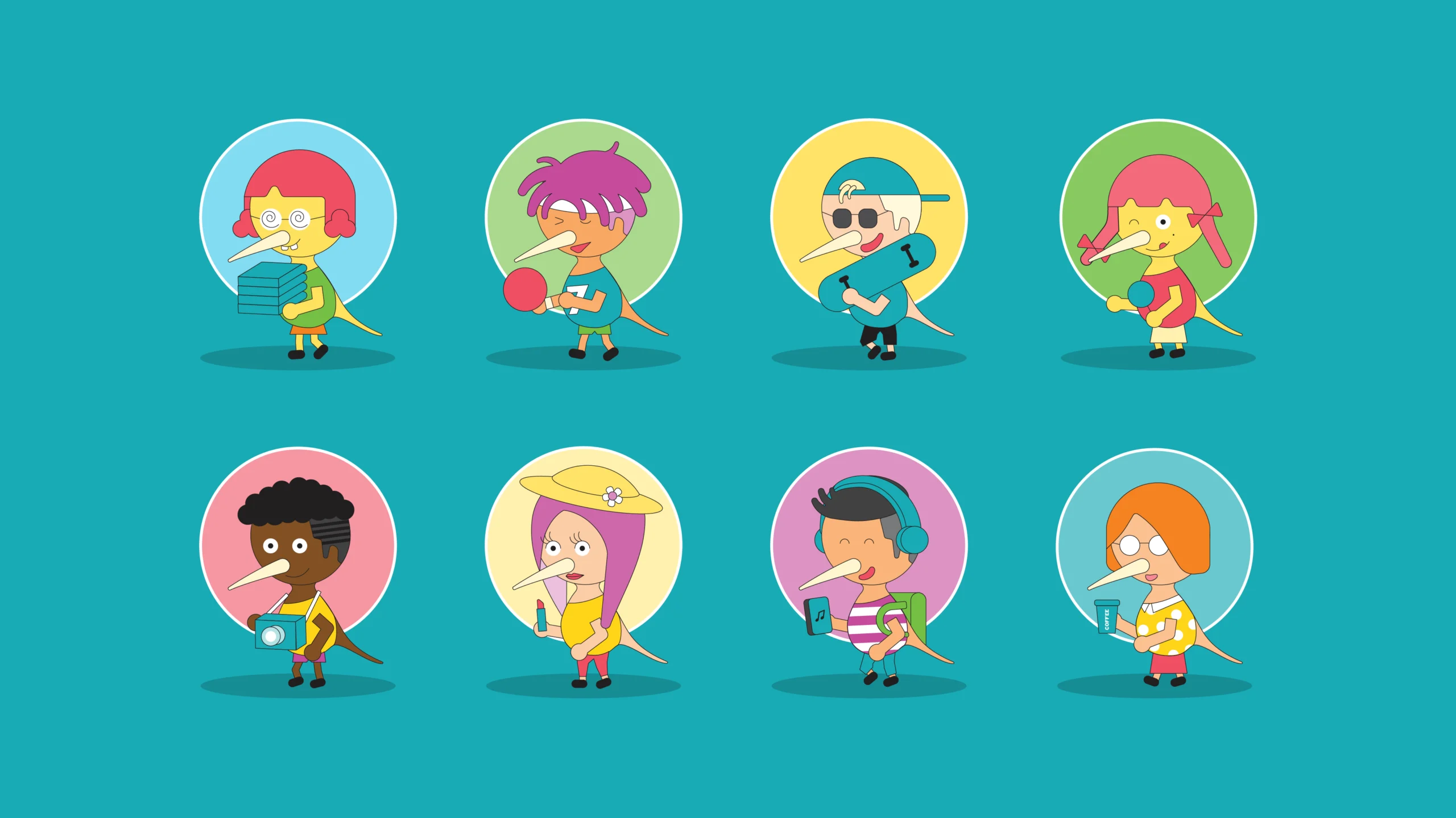
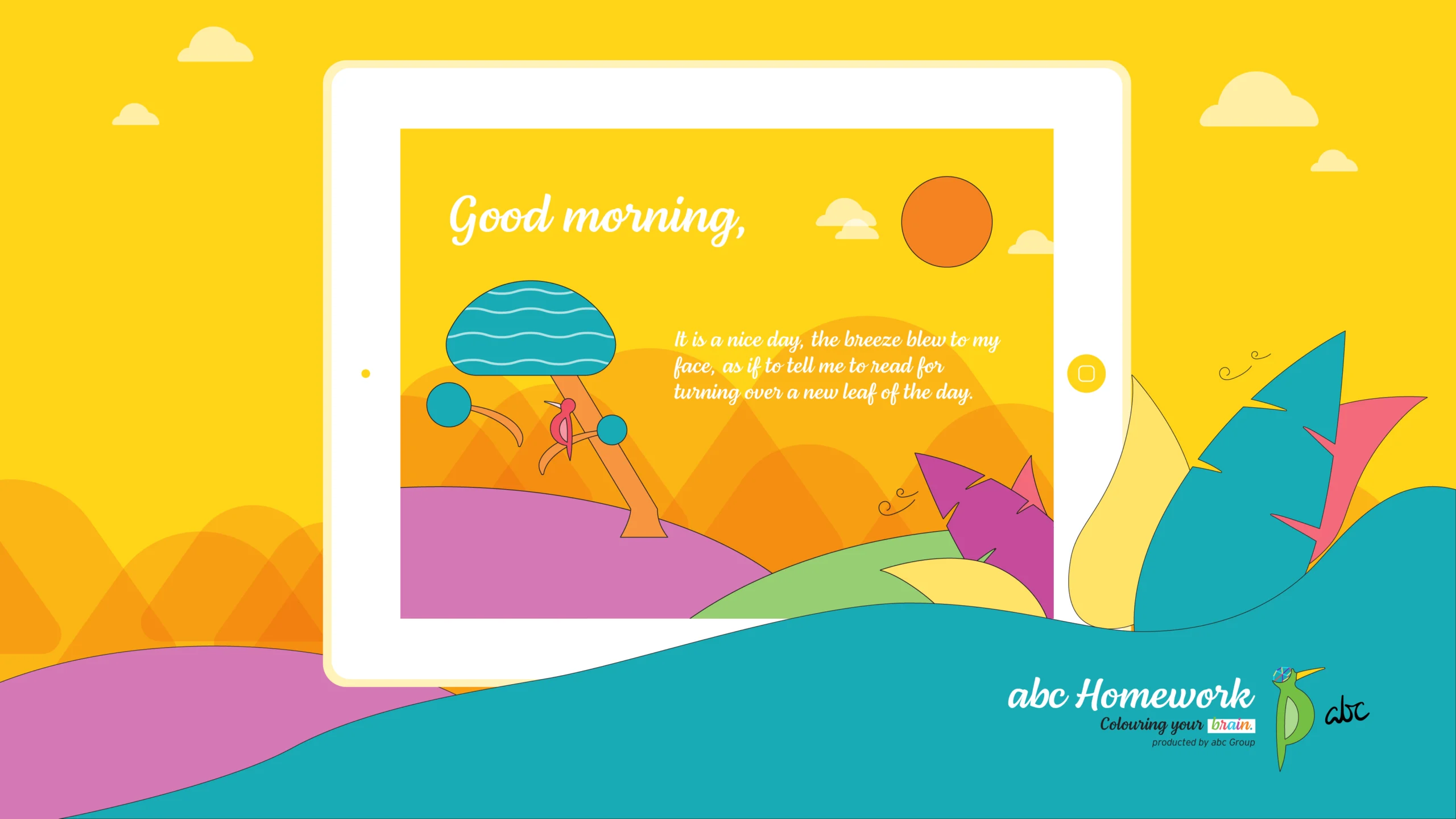
True power is forged in a merciless, bone-deep realignment of user cognitive psychology and high-fidelity product engineering. For the abc Education digital environment, we treated Apps UI/UX Design as a rigorous discipline of civil architecture. To capture and communicate with the target audience, the design infrastructure deploys bespoke icons, dynamic character designs, precise illustrations, and a calculated bright & attractive color palette. This aesthetic geometry forces an immediate psychological resonance. We are not just selling a static service; we stand with the user to reshape the educational landscape. Do what you love, love what you do—this interface is an ideological weapon designed to equip the brain and manifest internal substance.
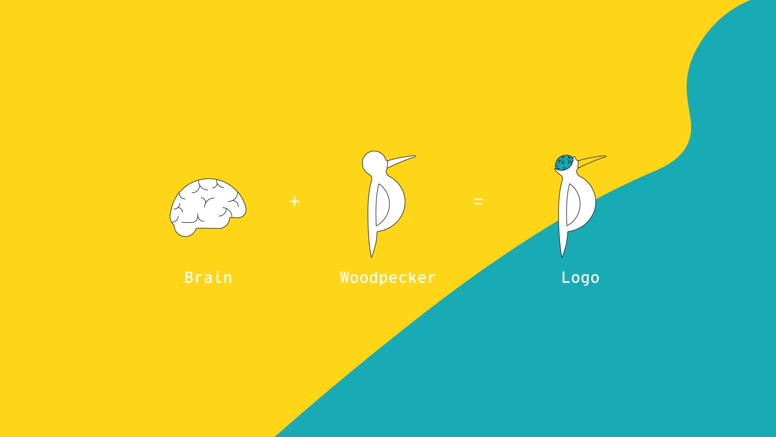
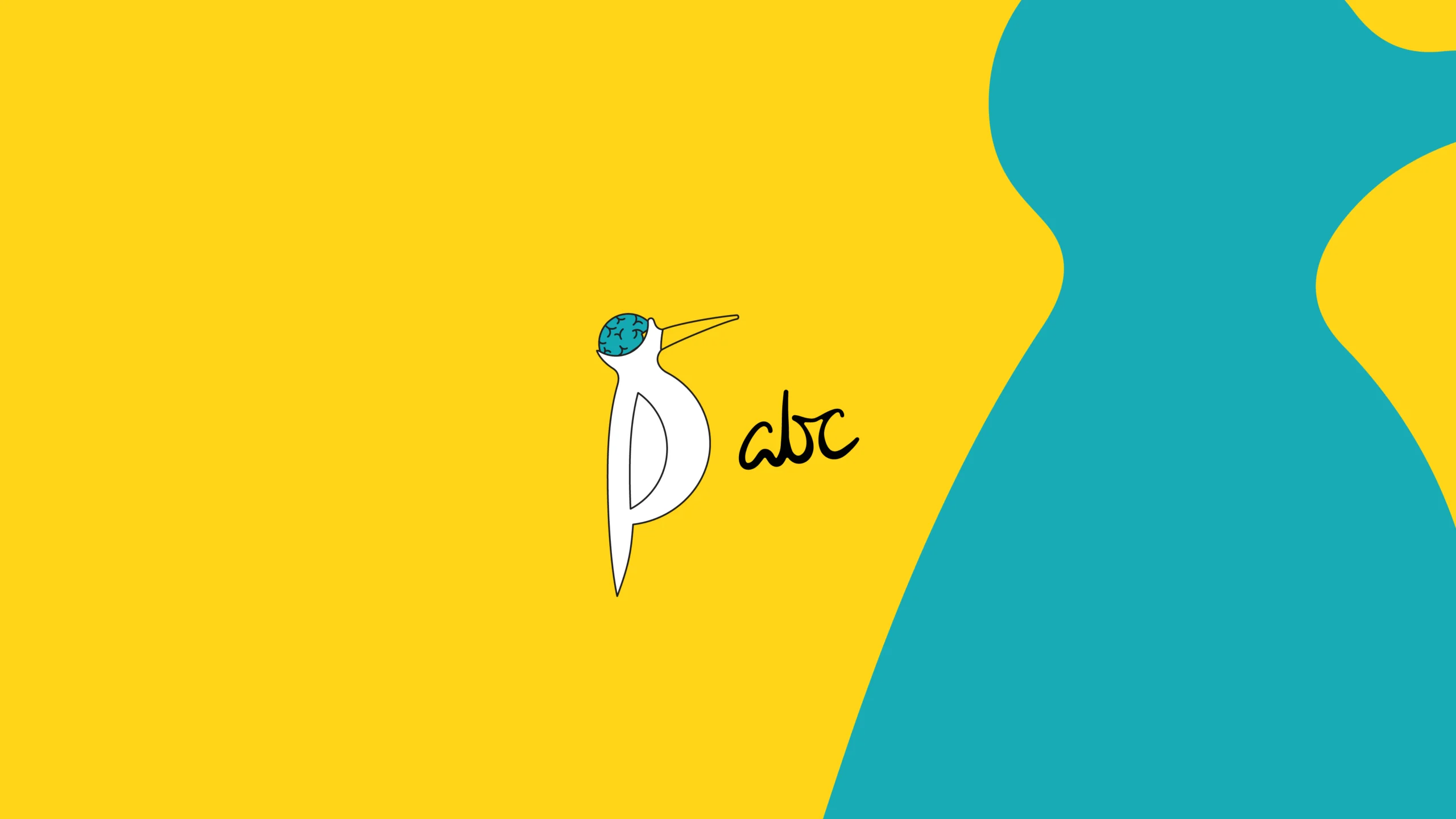
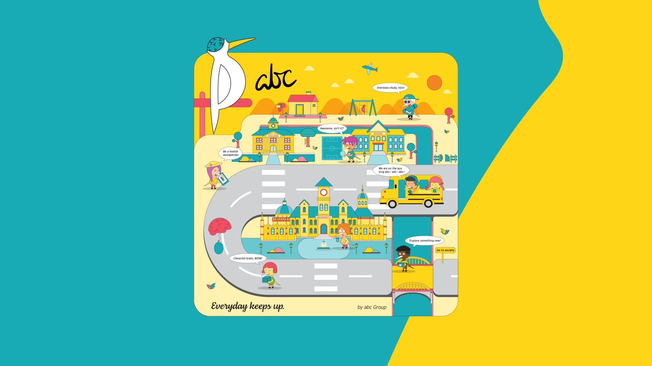
At the absolute center of this Kid Education Branding stands a meticulous alignment of nature and neuroscience: the minimalist fusion of the Woodpecker and the Human Brain. We deconstructed the enterprise structure to extract its ultimate corporate brand culture, establishing an irreversible visual gravity. Human intelligence absorbs knowledge from literature as raw nutrients for the intellect, mimicking how a woodpecker systematically extracts insects from tree trunks for survival. By elevating this biological relationship into a vivid, friendly, and geometric animal avatar, we have engineered a fierce and unshakeable visual sovereign identity. It dictates a singular industrial law: maximum structural performance through absolute aesthetic precision, forcing all potential competition into absolute irrelevance.