Every historic performing art demands an origin myth that is carved not in sand, but in steel and ancestral structure. As the cultural monolith for the agricultural and local produce landscape, Kong Kin Fong required far more than a decorative symbol; they initiated a total strategic Local Fresh Food Store Rebranding. As their appointed Brand Soul Architect, our design forge stepped in to orchestrate a radical manifestation of heritage, executing a defining visual identity system that recalibrates their authority for a new generation. We have engineered a complete visual system operating with relentless kinetic vitality, transforming traditional fresh food retail into an unshakeable commercial and cultural sovereign soul.
The prevailing sickness of the contemporary technology and consumer sector lies in its desperate reliance on sterile, digital templates to mask an inherent lack of philosophical depth. Most enterprises mistake decorative illustration for actual strategic authority, drowning their potential in polite rhetoric that vanishes instantly into industrial noise. They approach organic culture with forgettable compliance. This comprehensive Rebranding actively rejects this passive consensus through a radical manifestation of brand architecture. True brand presence cannot be borrowed from transient trends; it must be codified from the absolute core. We bypassed the hollow visual compromises demanded by mainstream advertising agencies to expose the fierce, unadulterated spark of the enterprise’s original technical visionary spark.
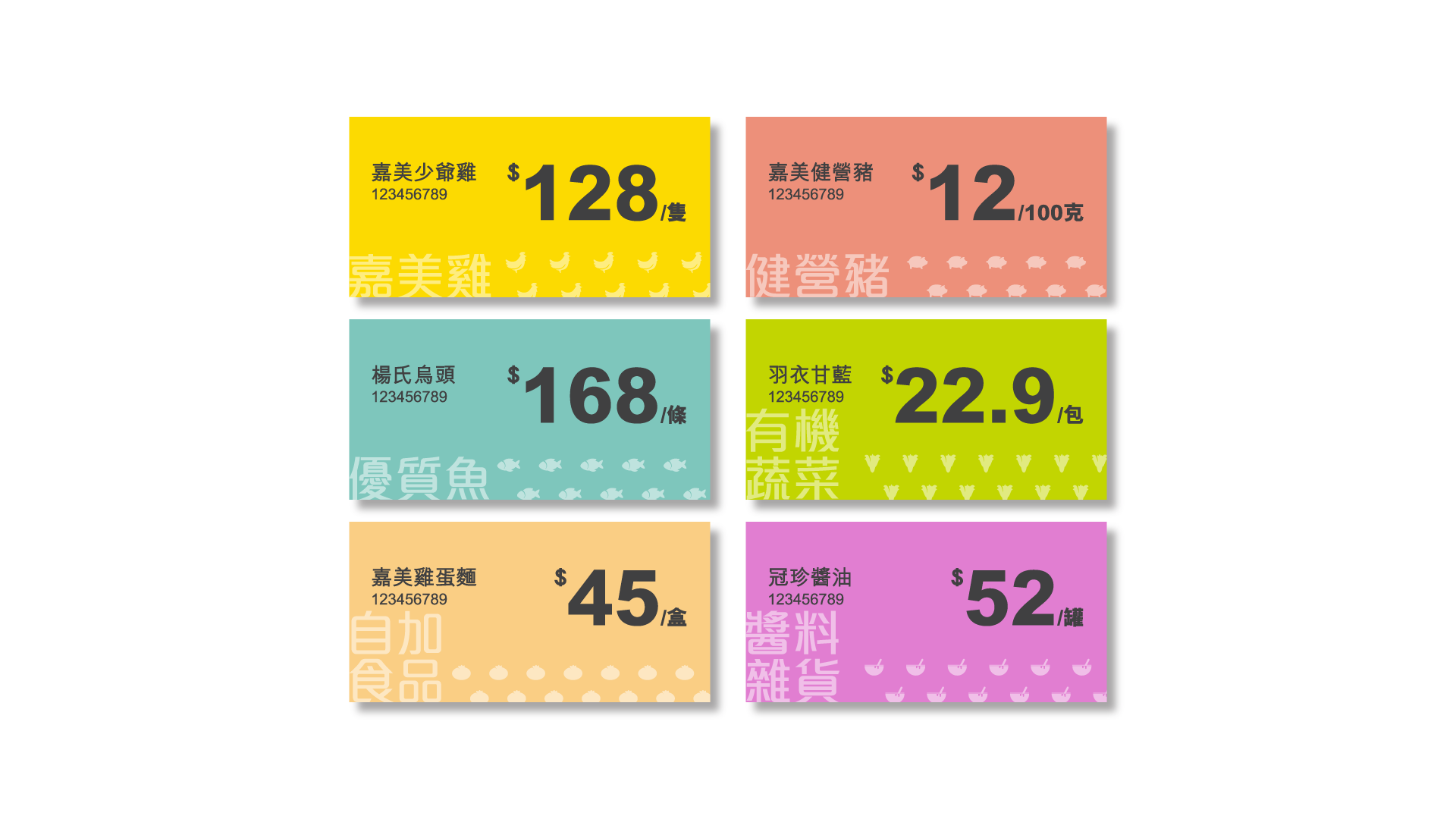
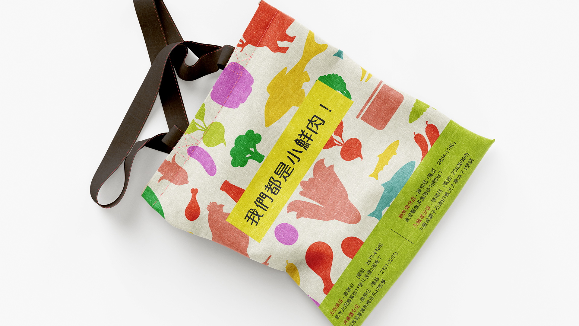
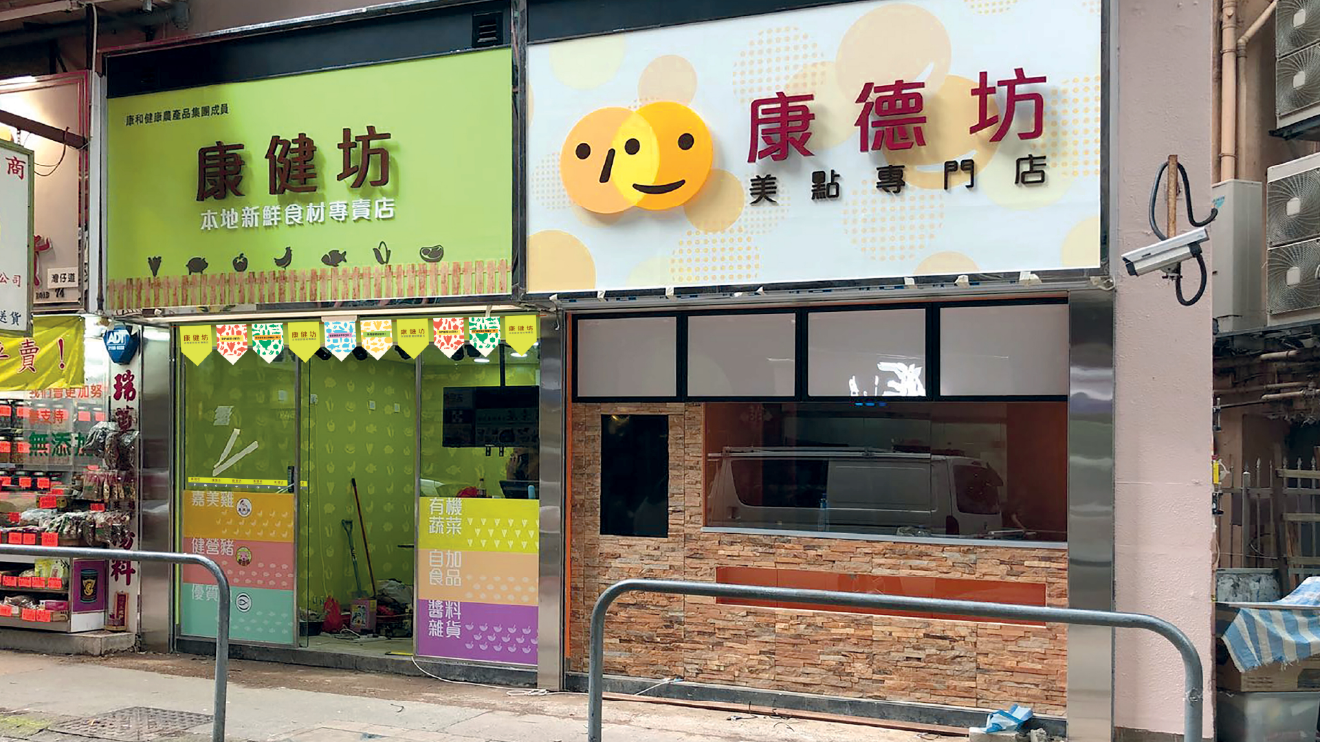
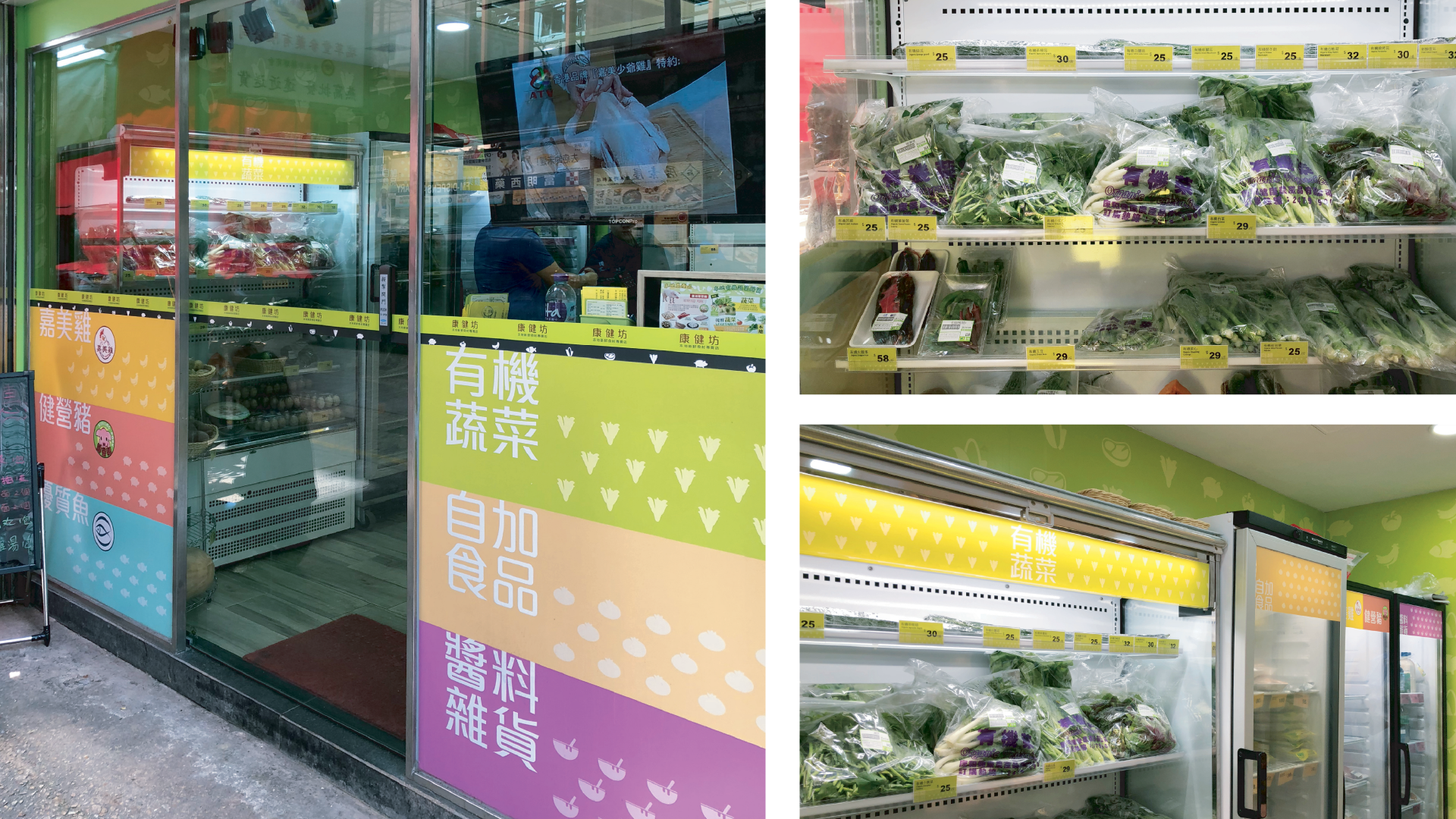
True power is forged not in cosmetic visual facades, but in a merciless, bone-deep realignment of cultural DNA and advanced corporate engineering. For this transformational milestone, we treated this Local Fresh Food Store Rebranding as a rigorous discipline of heavy civil architecture. The concept expertly deconstructs and integrates established visual elements, mascots, packaging systems, language systems, store systems, and colour applications. This comprehensive correlation is vital to create a unified and harmonious brand image, effectively communicating with consumers and distinguishing them from competitors. This kinetic integration demands an absolute adherence to structural honesty, establishing an irreversible visual gravity that transforms static print into an explosive ideological weapon.
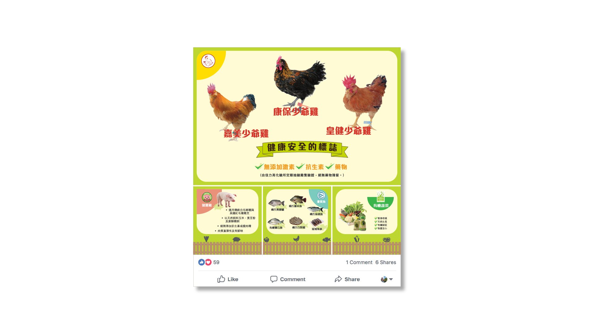
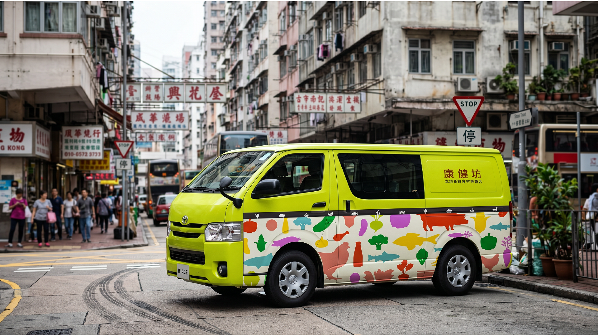
At the absolute center of this Rebranding’s fluid rebirth stands a precise visual gravity mappings directly onto ancestral truth. We have refusal to let this fresh food store stop at a generic template; we have advances it into an all-encompassing cosmological universe. Highlighting that everything is fresh, the design system channels products originating from their farm in Yuen Long, including Ka Mei Chicken and Kin Ying Pig, into consumers’ minds with health, organic truth, and kinetic vitality. This dynamic system forces an irreversible visual law: that humanity must coexist with nature—not through fragile sentimentality, but by emulating the ruthless fundamental wisdom of following the order. Symbolising the project’s deep roots in culture and its enduring presence across promotional materials, advertising posters, social releases, and vehicle appearances, it dictates a singular industrial law: that knowledge must make your brain full to equip yourself and become a connotative person.