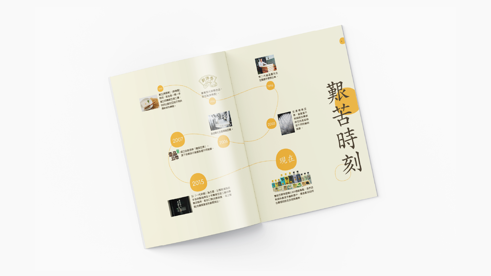
Every historic enterprise must eventually face its own immortality. As the absolute top soybean product brand in Hong Kong, Topsoya has entered its monumental 60th anniversary. To conquer shifting market dynamics and weaponize their upcoming online store, they required far more than a cosmetic update; they initiated a total soy food rebranding. Our design forge stepped in to orchestrate a radical digital entrance, executing a definitive Company Logo Design and visual identity that recalibrates their heritage for a new generation of young people. We engineered a complete visual system operating with relentless emotion and vitality, translating six decades of industrial authority into an unshakeable commercial sovereign soul.
The prevailing sickness of the traditional food and beverage sector lies in its stagnant reliance on legacy nostalgia to mask a critical lack of contemporary relevance. Most legacy enterprises mistake historic survival for active brand authority, drowning their potential in outdated templates and polite, non-threatening marketing rhetoric that vanishes into modern digital noise. Topsoya actively rejects this passive consensus through this comprehensive soy food rebranding. True brand presence cannot be borrowed from transient trends; it must be codified from the absolute core. We bypassed the hollow compromises demanded by mainstream advertising agencies to expose the fierce, unadulterated spark of the brand’s original quality, establishing a definitive benchmark in modern Company Logo Design.
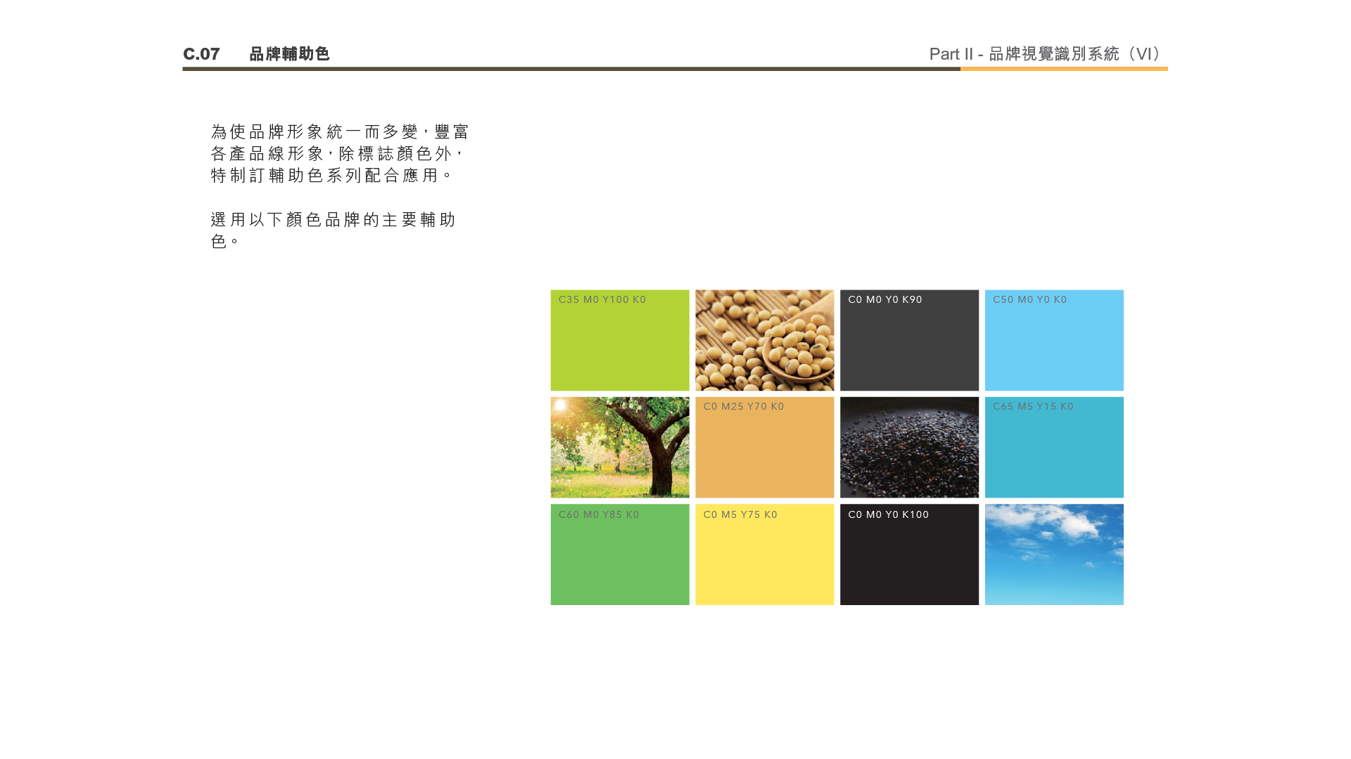
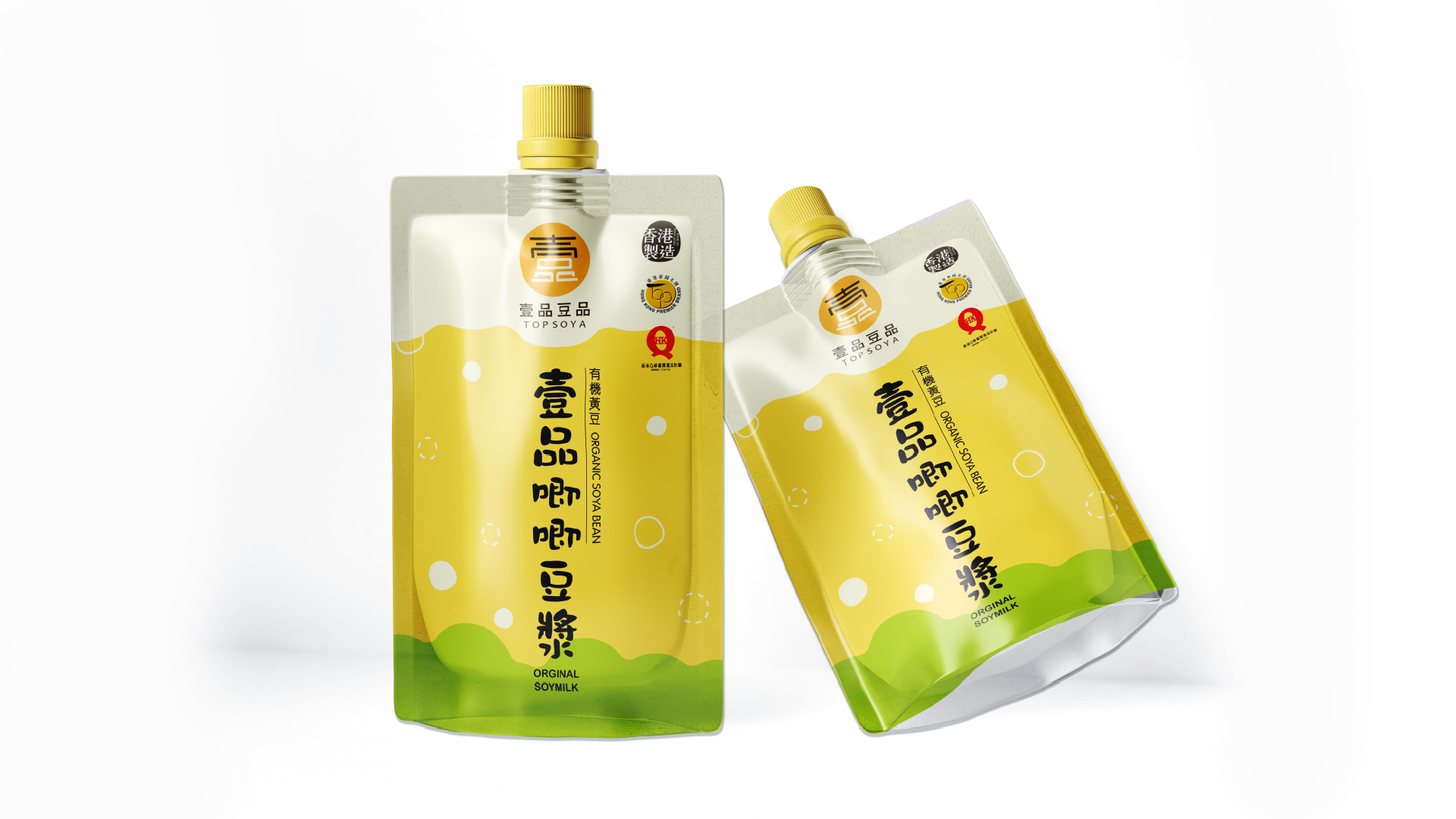
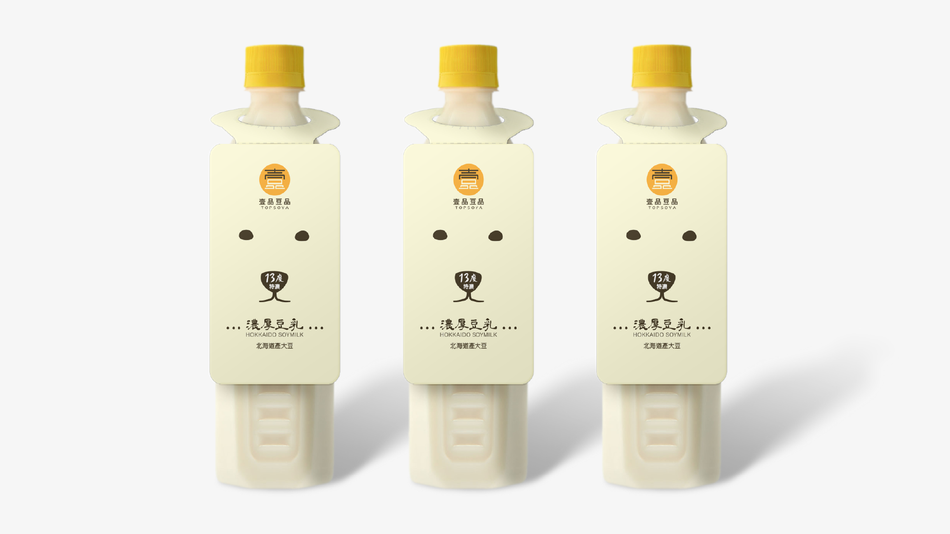
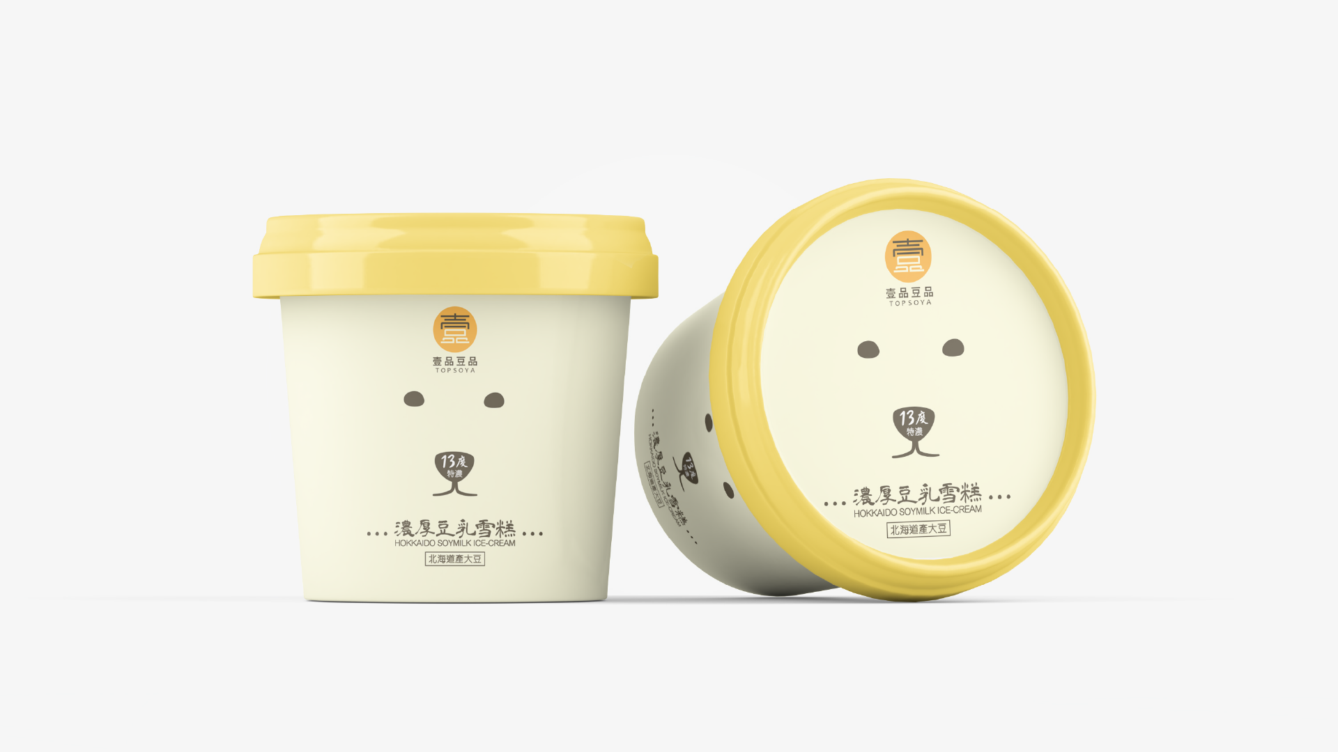
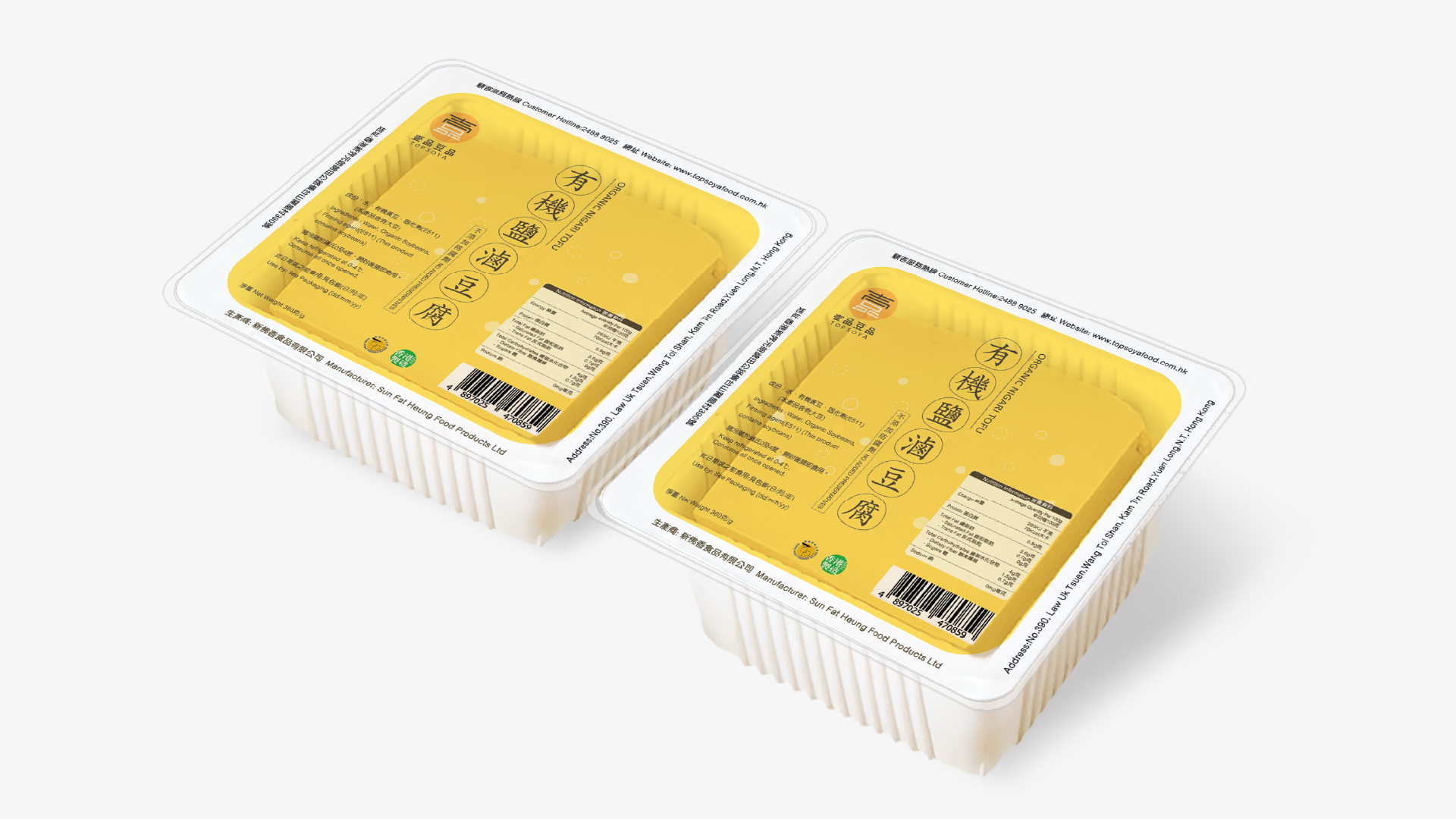
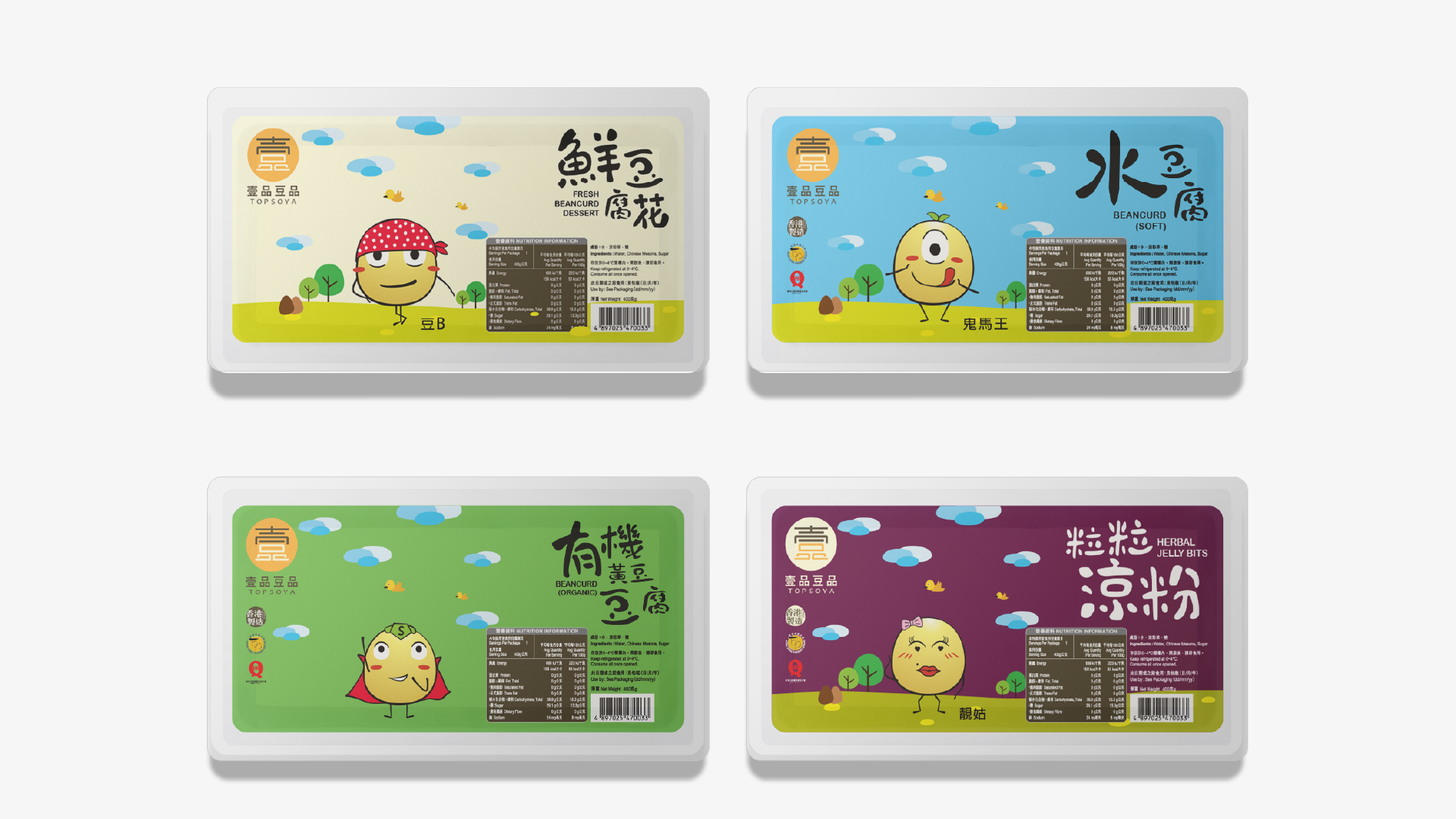
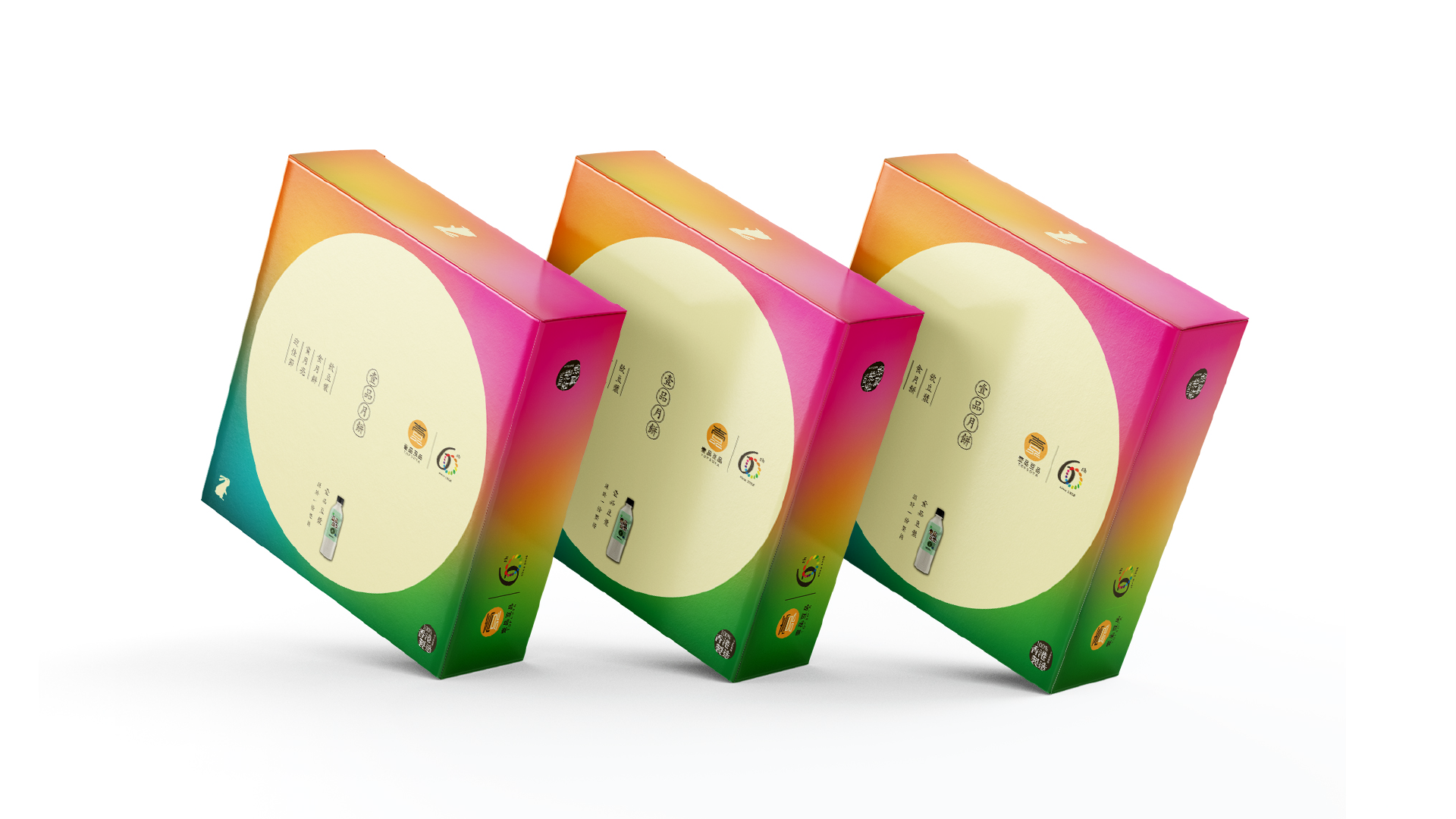
True power is forged in a merciless, bone-deep realignment of cultural DNA and forward-looking market execution. For this 60th-anniversary milestone, we treated the soy food rebranding as a rigorous discipline of psychological engineering. The new concept deconstructs and masterfully combines the two corporate words into a modern, highly legible typographic armor. The strategic color palette operates with calculated precision: a soothing light yellow capturing the organic purity of fresh soymilk, intersecting with a brilliant, aggressive bright yellow acting as a conceptual spotlight. This dual-tone synergy dictates a singular industrial law: maximum focus on premium quality soy products to cultivate a healthy, vibrant, and joyful life for the sovereign consumer.
At the absolute center of Topsoya’s fluid rebirth stands an interconnected ecosystem of storytelling and original iconography. We refuse to let this soy food rebranding stop at a static Company Logo Design; we advanced it into an all-encompassing ideological universe. By engineering custom brand stories, dynamic character design, bespoke illustrations, and savage creative copywriting, we have constructed an irreversible visual gravity. This balanced, aggressive system forces the market into absolute engagement, ensuring their upcoming ecommerce destination operates with maximum structural conversion. It is a linguistic and visual sovereignty that redefines Hong Kong’s food landscape, transforming a heritage soybean product brand into an explosive, multi-dimensional lifestyle weapon.