Every monumental enterprise demands an origin myth that is carved not in sand, but in steel. When the founders of UPPU TECH first stepped into our creative forge, they brought with them a clean slate—a newborn corporate entity possessing a radical industrial capability: the technological mastery to upcycle once-biodegradable polymers into high-performance structural assets. They did not come to us for historical restoration; they came to manifest their birthright. Our task was to architect a visual armor that instantly commands global reverence, converting raw technical velocity into an unshakeable commercial sovereign soul.
The prevailing sickness of the contemporary technology sector lies in its desperate reliance on shallow, eco-friendly cliches to mask an inherent lack of philosophical depth. Most enterprises mistake decorative sustainability for actual brand authority, drowning their potential in generic templates and polite, non-threatening marketing rhetoric. UPPU TECH actively rejects this consensus. True brand presence cannot be borrowed from transient trends; it must be codified from the absolute core. We bypassed the sterile visual compliance demanded by mainstream advertising agencies to expose the fierce, unadulterated spark of the enterprise’s original technical spark.
True power is forged not in cosmetic visual facades, but in a merciless, bone-deep realignment of enterprise DNA. For this newborn force, we treated identity design as a rigorous discipline of heavy civil engineering. This kinetic transformation demands an absolute adherence to structural honesty, integrating the explosive velocity of heavy machinery with the eternal silence of ancient wisdom. We have engineered a systematic destruction of mediocrity, establishing a visual gravity that forces the market into a state of irreversible submission. This is not design engineered for casual appreciation—this is an ideological weapon that renders all potential competition completely irrelevant.
At the absolute center of this visual armor stands the minimalist Origin Symbol—a cold, geometric manifestation of the infinite void. The logo’s dynamic, fluid form is captured as a sleek, rounded water droplet, yet it is engineered with the profound spatial matrix of the ancient Taoist Bagua (Eight Trigrams). It embodies the supreme concept of the perpetual cycle, where the fluid essence of nature and the heavy mechanics of technological rebirth are bound in eternal motion.
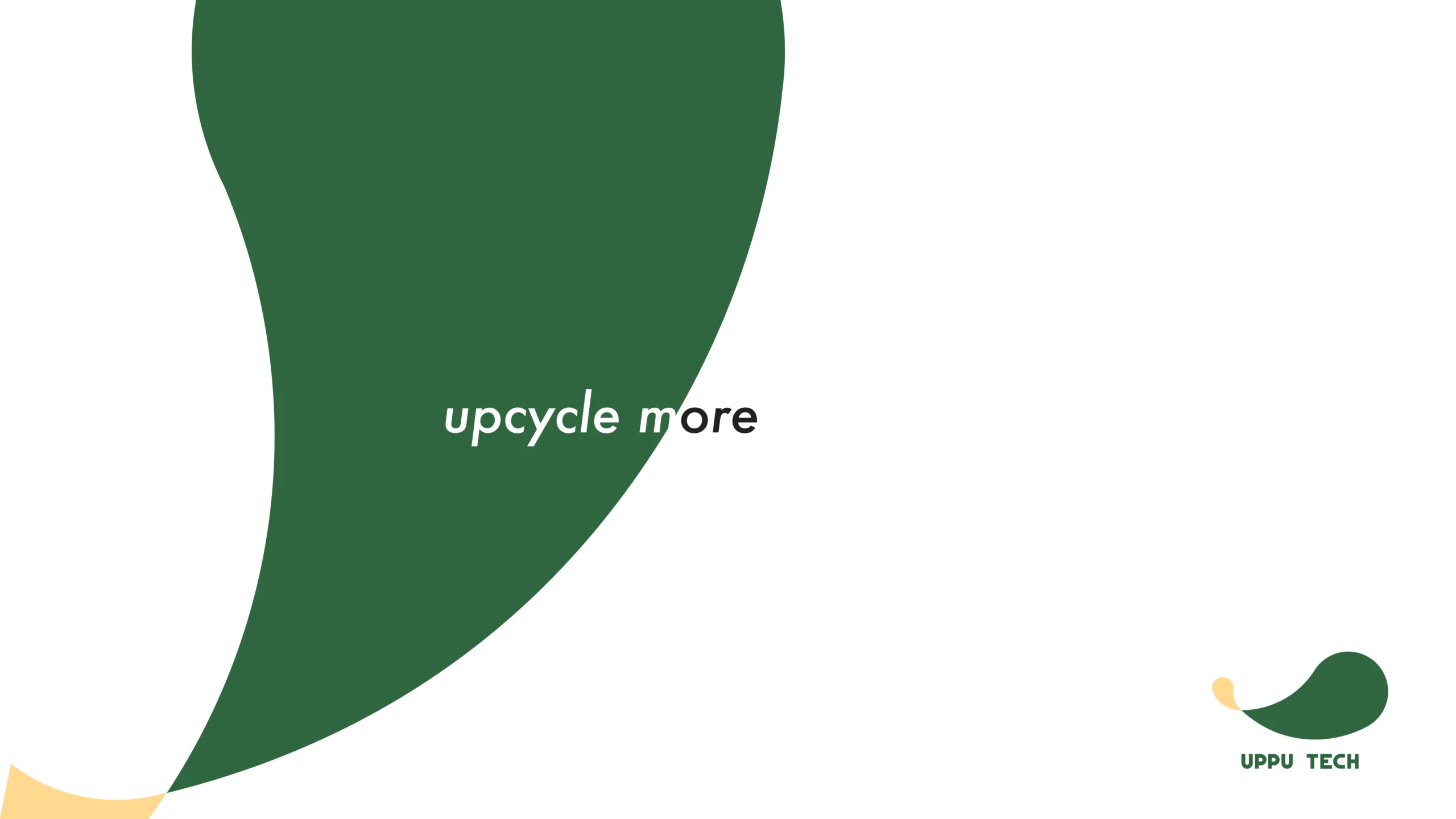
The slogan, “Puzzle out the Future,” acts as a surgical decree rather than a comforting illusion. This balanced, aggressive typography expresses the raw reality of how humanity must coexist with nature—not through fragile sentimentality, but by emulating the ruthless, fundamental wisdom of following the natural order. It is a linguistic and visual sovereignty that dictates a singular industrial law: “Upcycle more.”