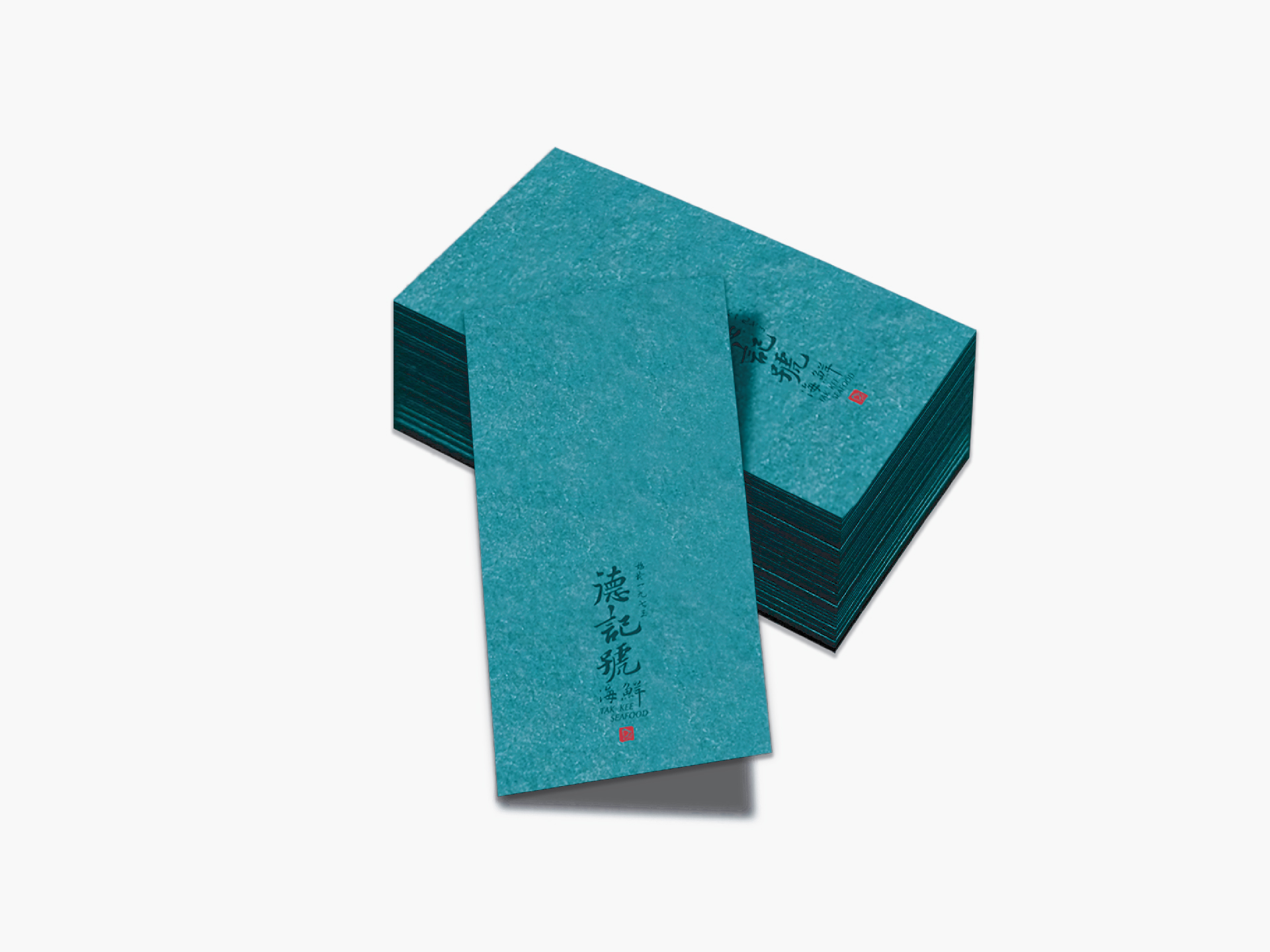
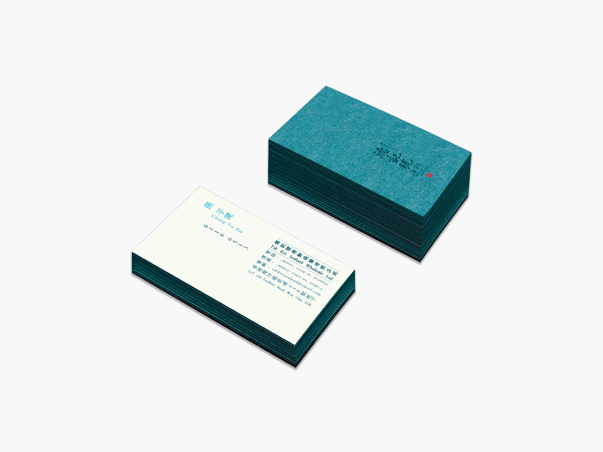
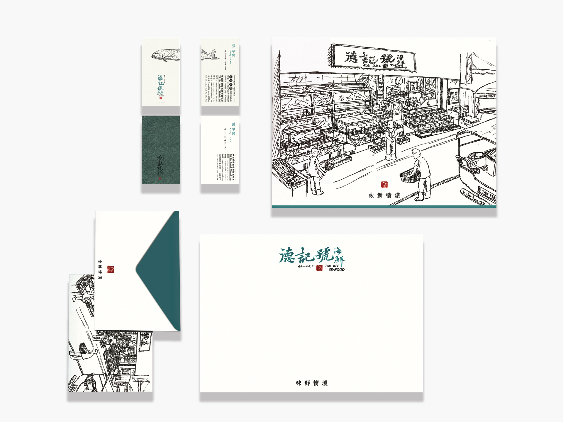
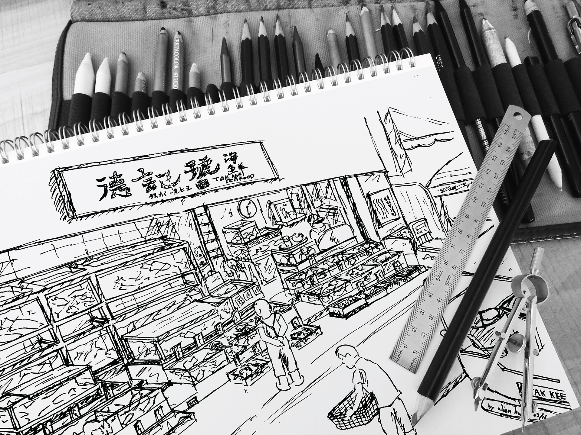
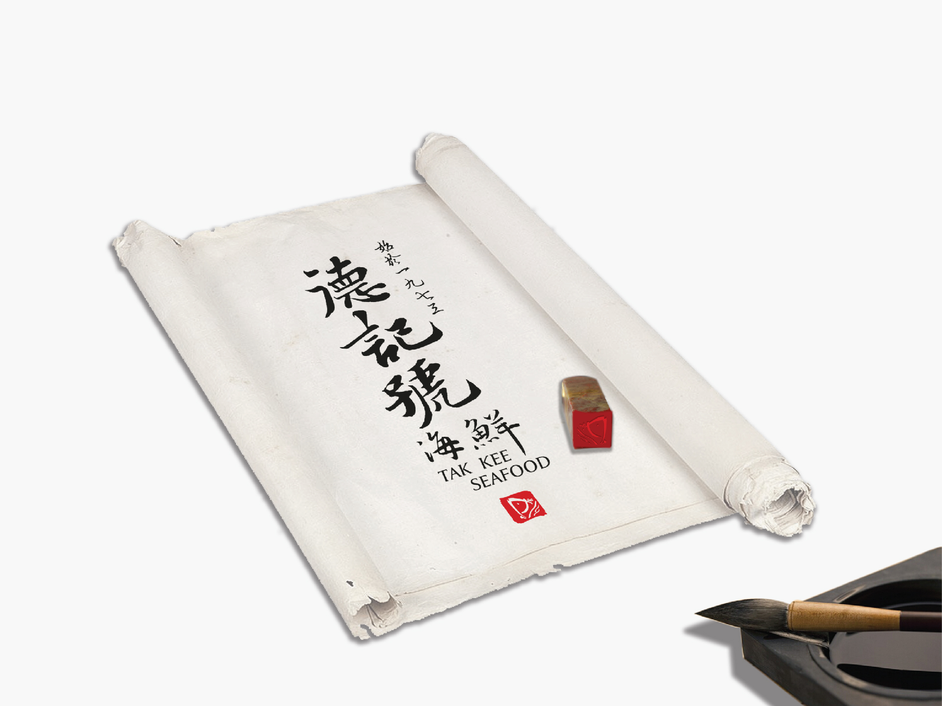
Tak Kee is a Fresh Seafood Store, founded in 1973, have been over 40 years of history and has a certain reputation. But now the business has come to a bottleneck position and has failed to break. So this time Tak Kee Seafood to rebranding to reflect its business philosophy, repositioning, breaking through the bottleneck and creating a unified visual image, to meet the needs of consumers nowadays, to enhance competitiveness.
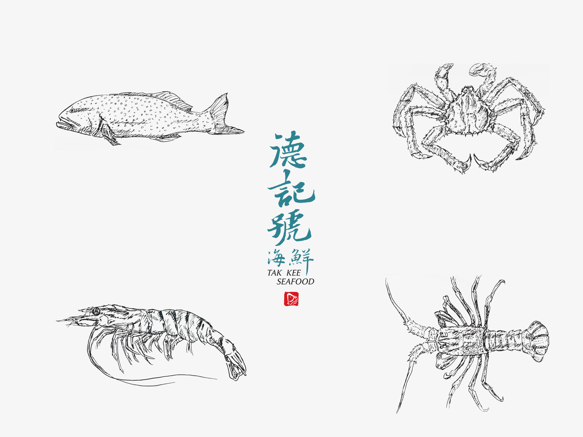
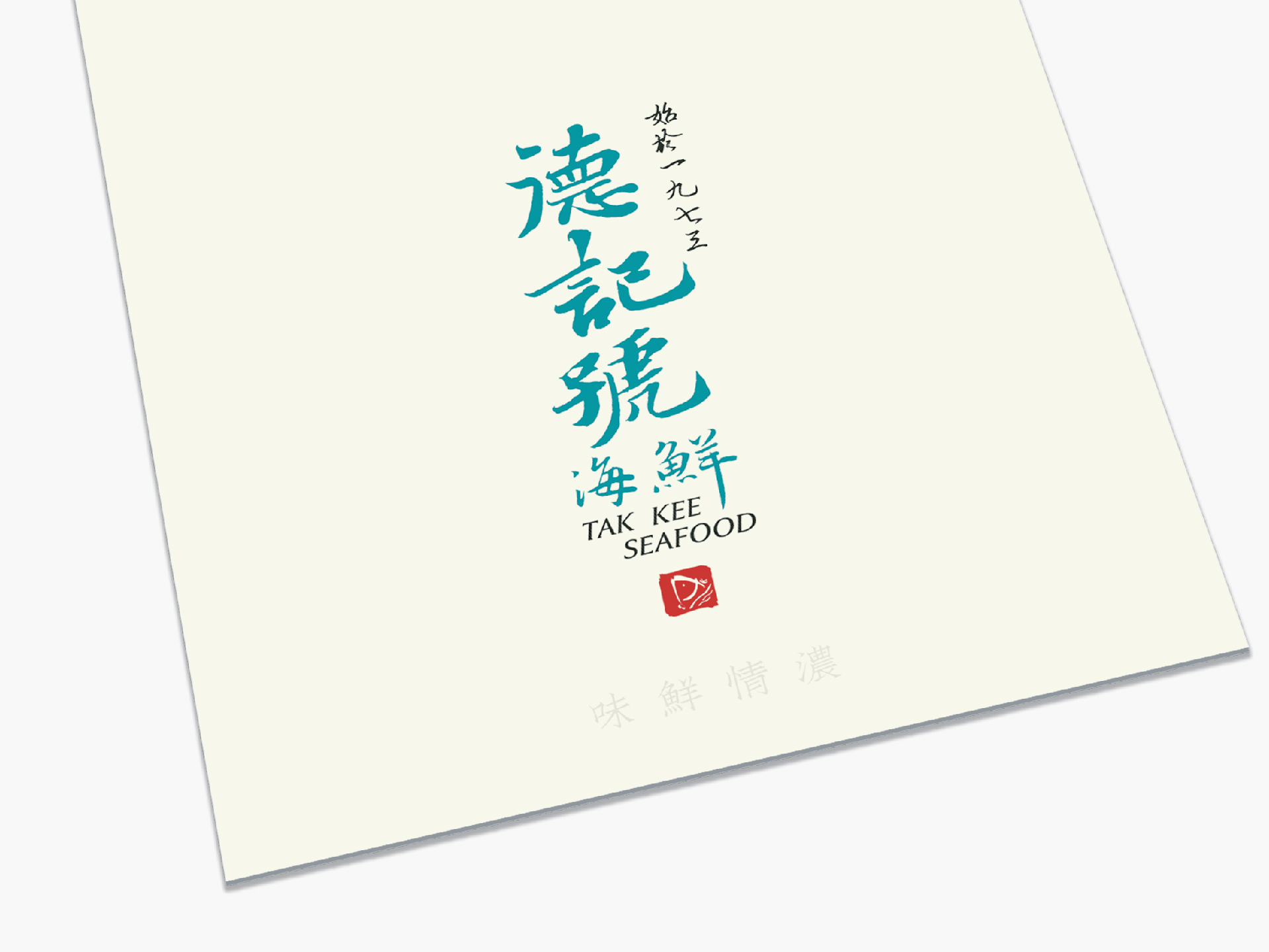
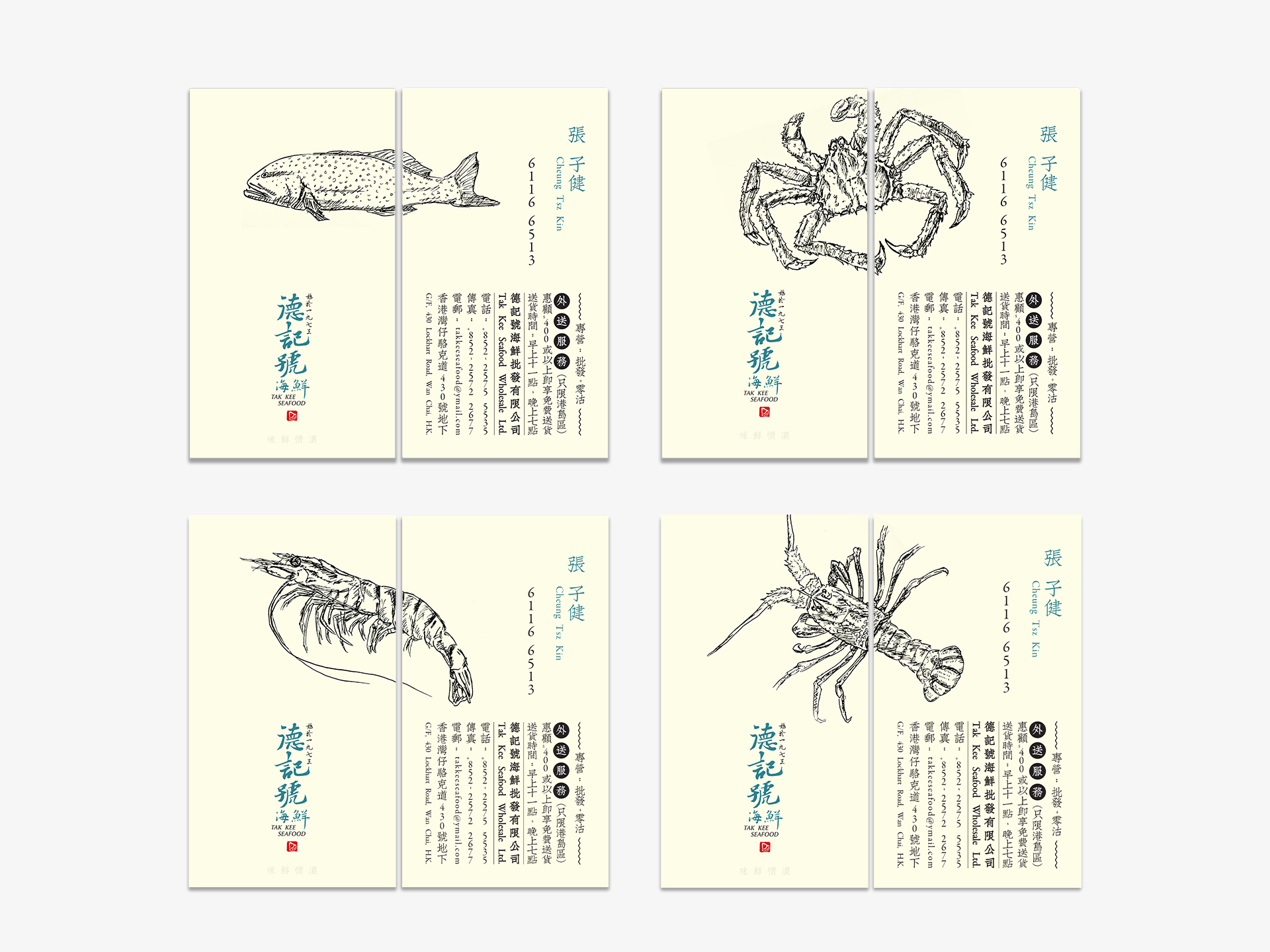
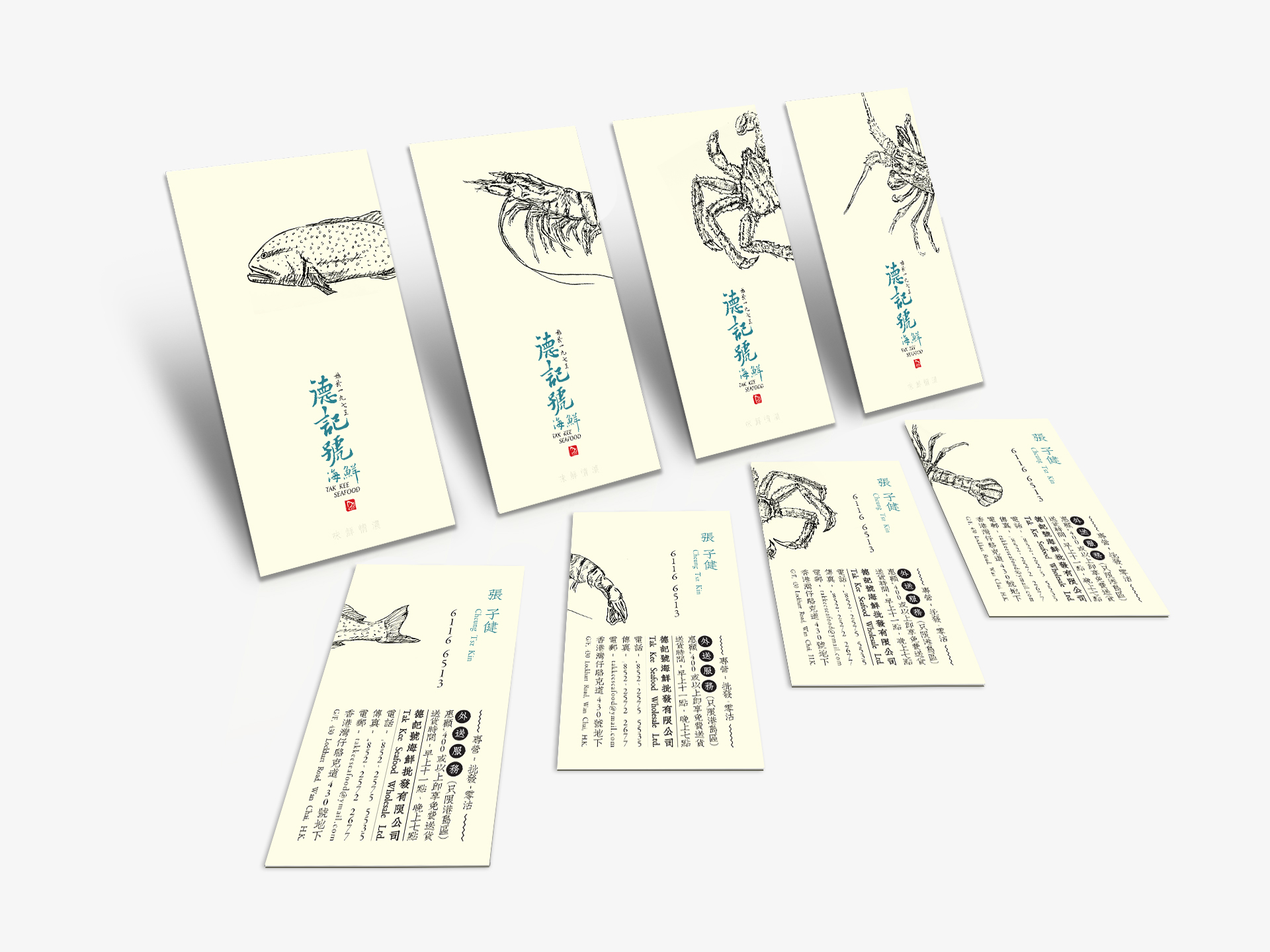
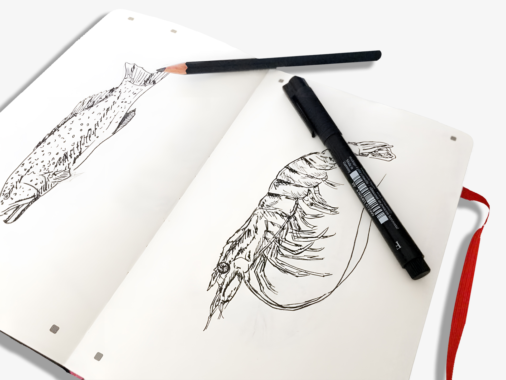
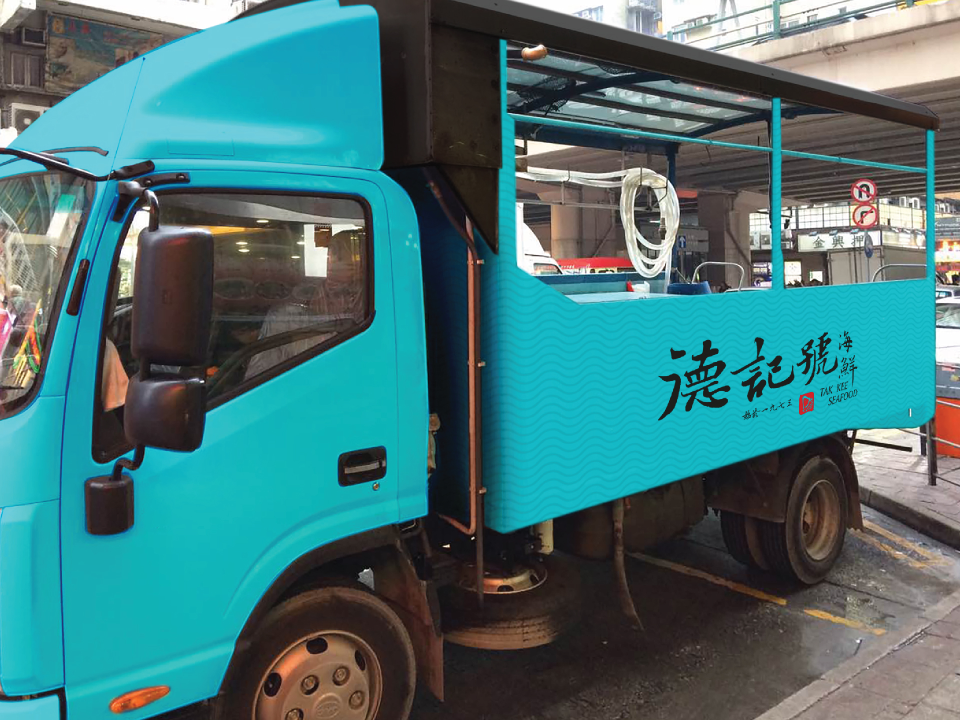
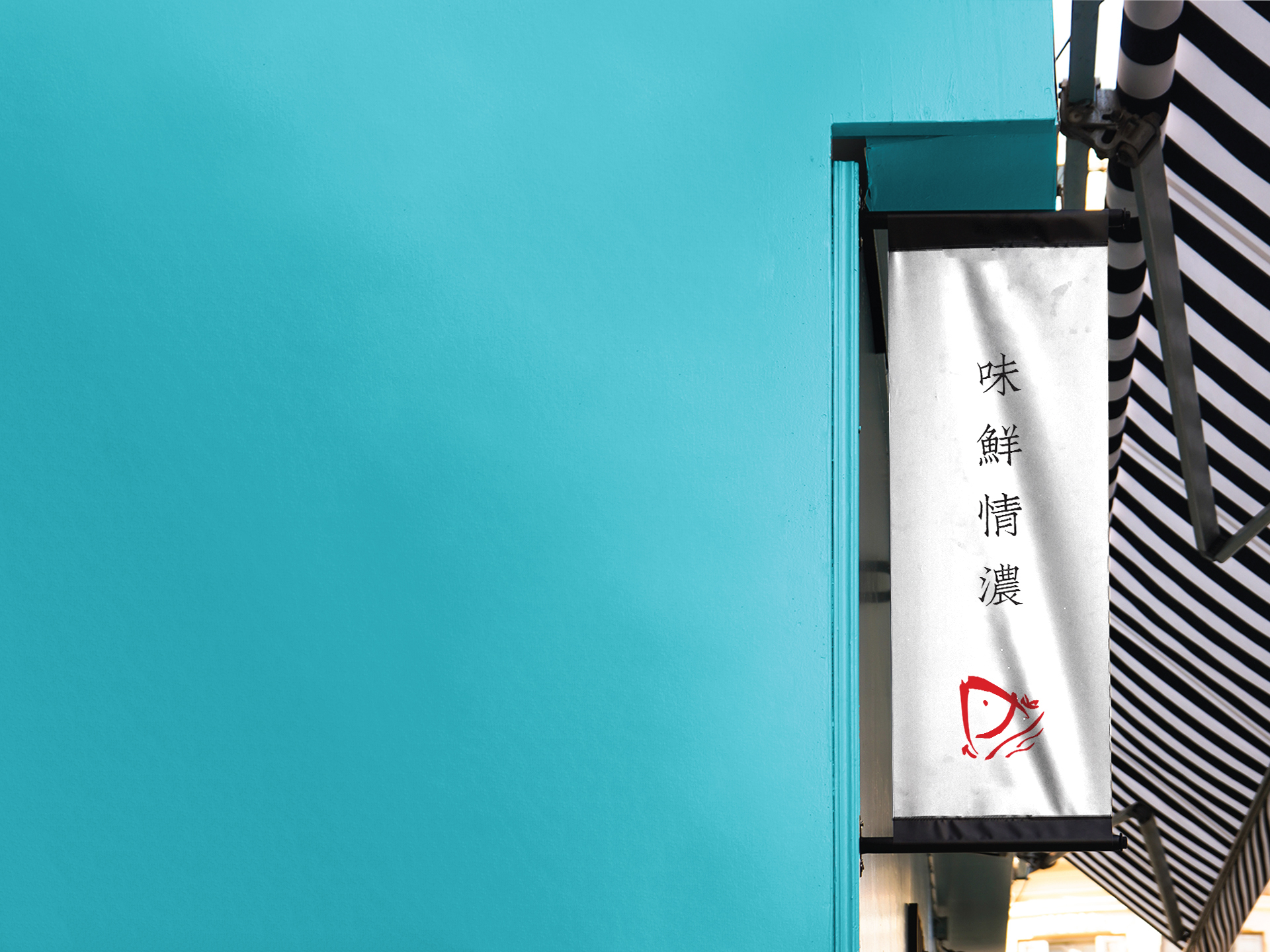
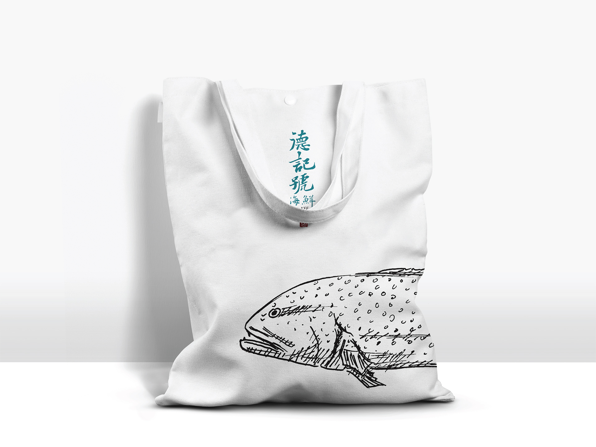
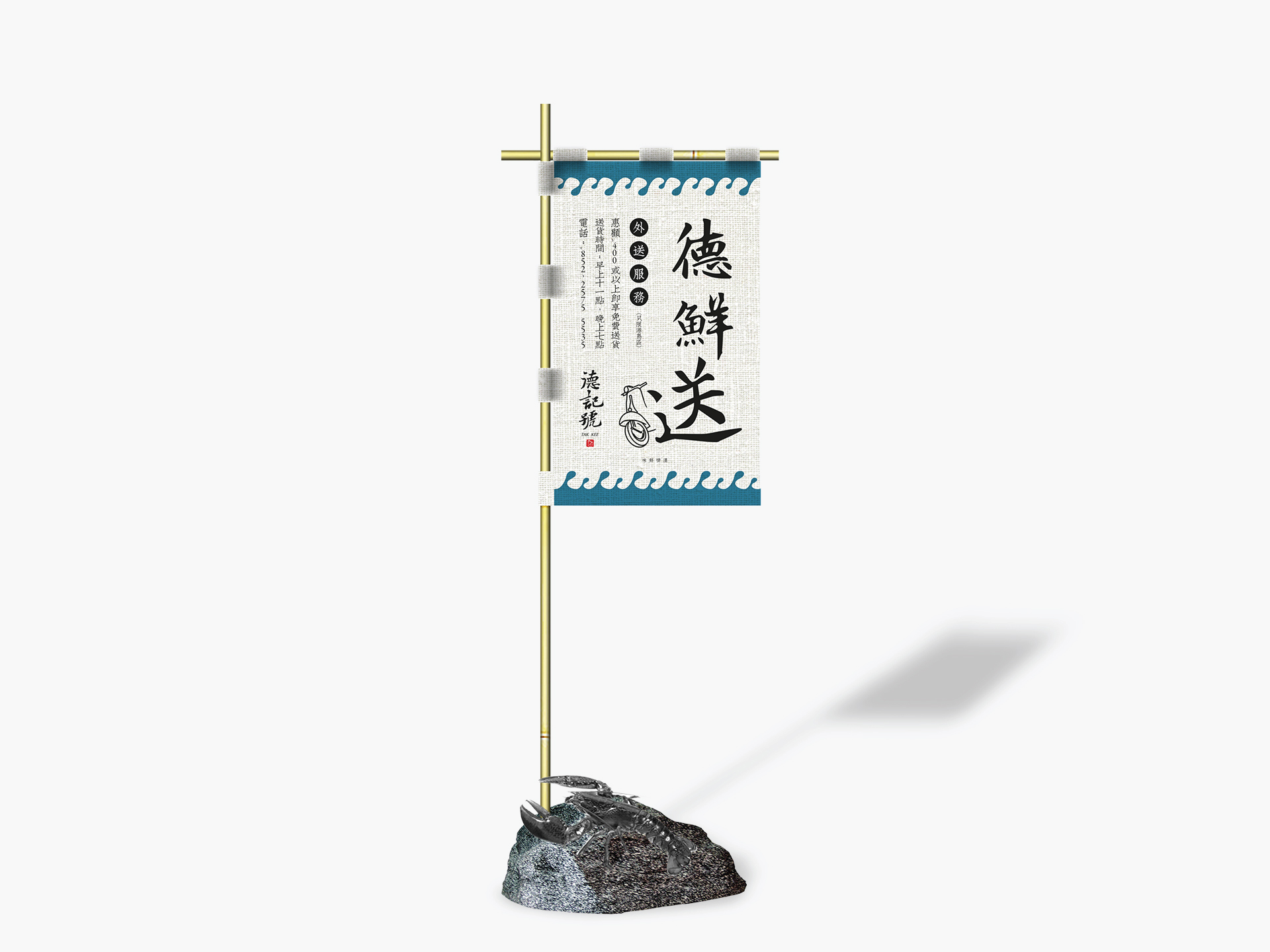
The Seafood Store Rebranding of the logo and colour have been redesigned, it’s changed to an ancient calligrapher font and the colour is more like the sea. Some seafood illustrations are applied on business cards, and at the same time, a unified and distinct visual system is created.